

Let’s start with a basic example based on distance. We have a network with road infrastructure and transportation zones.

Let’s analyze accessibility from any part of the network to the center of the CBD:

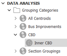
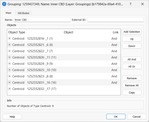
A Grouping containing the centroids (transportation zones) that correspond to this area will help us keep these together in a single set for analysis.
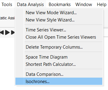
A first analysis may be, given that we have the road infrastructure available, to visualize the distance from any section to this area. The Isochrones functionality is available from the Data Analysis menu.
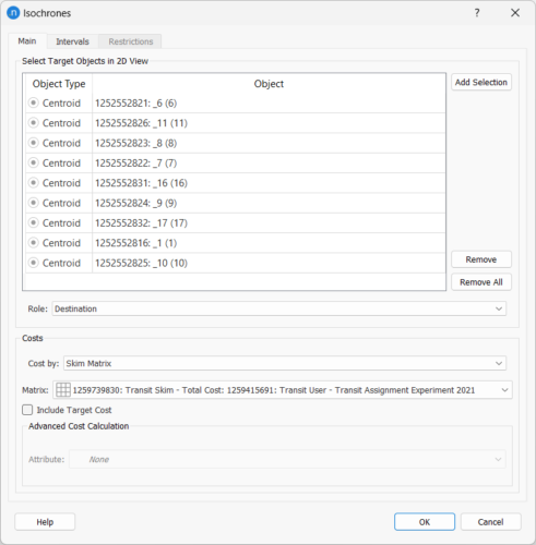
In the Isochrones dialog, there are several options to generate different accessibility maps. First, we must specify whether we want to analyze the accessibility from a location or to a location and set the location, which can be a centroid, a set of centroids, a section, or a set of sections. Then we must choose what cost per link we want to use: distance is the default option, but we can also use the travel time in free flow conditions, or any other attribute (for example, a time series of travel time produced by a mesoscopic simulation). If we just want to visualize accessibility from zone to zone (instead of per section), we can choose a skim matrix that already provides the interzonal cost, instead of computing it on-the-fly based on a shortest path calculation and a cost per link.
We cannot directly select a grouping of centroids as our target destination, but there is an option in the grouping context menu to select the objects belonging to it, and a button to add the selection in the Isochrones tool dialogue. We then set these transportation zones as Destination (in the Role field) to color both sections and zones according to their distance to the closest centroid within the grouping. The Intervals tab allows us to configure the view styles that will automatically be created (but we can modify them afterwards, as they are normal view styles). The Restrictions tab allows us to restrict the sections that can be used depending on their road type or the fact that they are accessible to a given vehicle type.
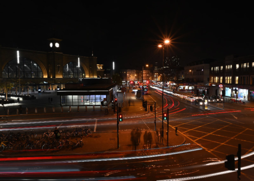
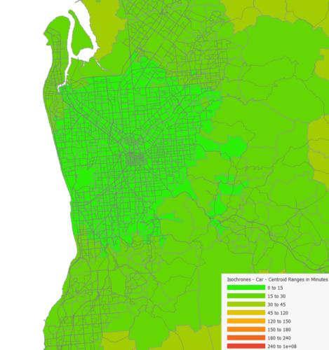
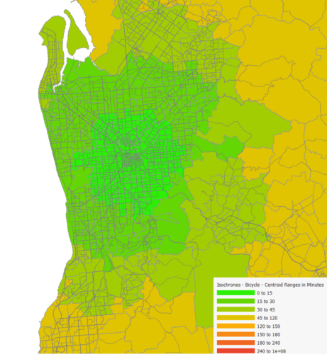
Hiding or showing the centroid polygons, and tuning the bar width, you can obtain maps like the following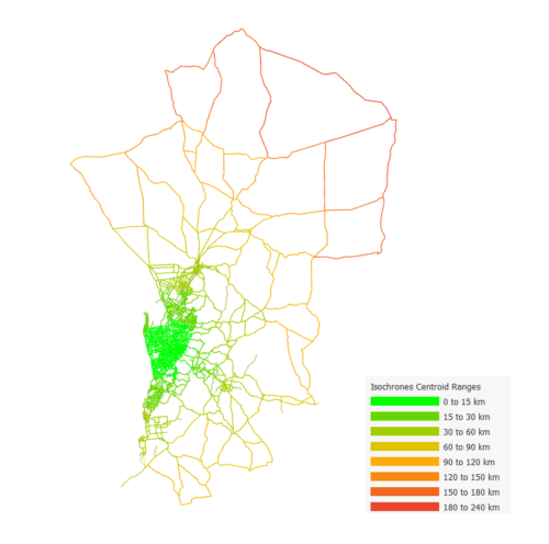
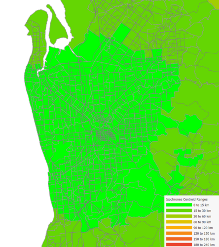
While an accessibility analysis based on distance is the simplest one that we can run, it is certainly not the most useful, as it doesn’t take into account the mode of transportation or the speed of the vehicle.
To calculate the travel time from any origin to the center of the CBD differentiating by car or bicycle it’s important to define the available infrastructure per transportation mode, that is, which vehicles are banned on each section.
Using travel time instead of distance will allow us to take into account the different speeds of bicycles and cars. If we have a validated demand, we can run assignments and use the output link travel time (from a function component in case of a macroscopic assignment) so that we also consider congestion. Otherwise, we can run an All or Nothing assignment with very low demand to obtain an uncongested travel time (that still takes into account the different speed of a car compared to a bicycle):
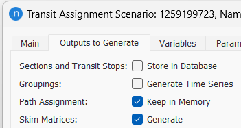
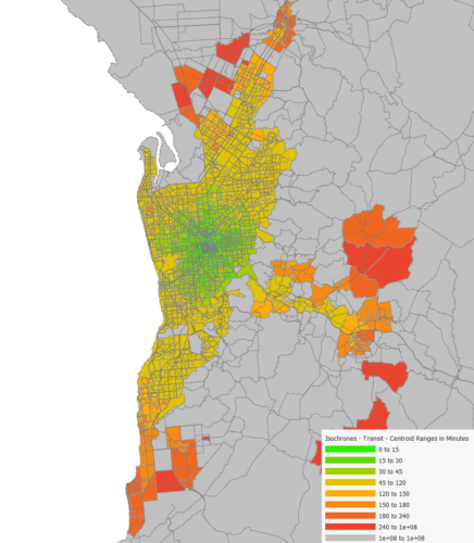
For transit accessibility analyses, we need to have in the model more than just the road infrastructure. The transit infrastructure consists of connections from zones to transit stops, transit lines with routes and schedules, walking times for transfers to other transit stops and the travel time of a trip in the transit services will be the sum of walking time to and from the transit stops or during transfers, the waiting time at the transit stops and the in-vehicle time. All these travel time (and other cost) components are obtained as the result of a Transit Assignment, as skim matrices. Assigning a matrix with 1 passenger for each OD pair with an All or Nothing assignment will allow us to obtain these skims even if we don’t know the demand.
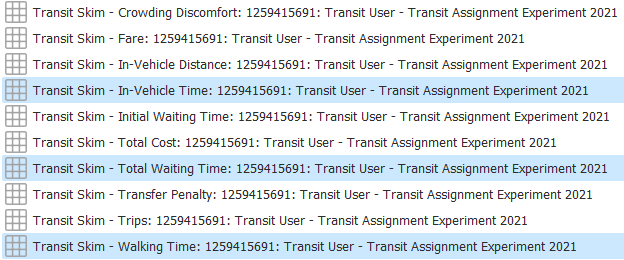
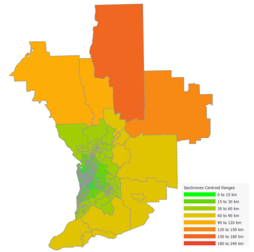
Adding up these three matrices will give us the travel time from any zone to any zone in the network. With this information, we can use the Isochrones tool to produce the accessibility map to get to the center of the CBD from any of the transportation zones in the network. Note that some of the transportation zones do not have transit service, so they will be colored gray.
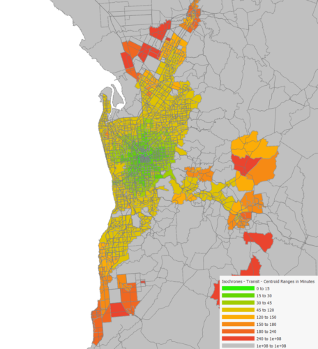
If we now increase the frequency of the bus line that serves the area on the east, we can see how the accessibility from this area to the center of the CBD improves.

How to get matrix development outputs for UK Department for Transport standards (TAG).
Tessa Hayman explains how you can use the new functionalities in Aimsun Next 23 to create outputs for monitoring changes during matrix development as outlined in the UK’s Transport Appraisal Guidance (TAG).